
The Invisible Work That Makes Things Better
When the best improvements are the ones you don’t notice.

Hey folks!
I hope you had a wonderful New Year’s celebration! Whatever your tradition, I hope you celebrated life because the clock is ticking!
Sidenote: I finally shipped the Terminal App that I’ve been using to build DeathNote and a newsletter too for updates:
If this is your thing, then check it out!
Ok, so back to the updates!
It’s been a few weeks since the last update, and most of what we’ve been doing isn’t the kind of thing that makes for flashy screenshots. No new animations. No redesigned dashboards. Just the quiet, methodical work of making something that is already good a little bit better.
Sounds like building software.
And that’s the thing about building software you want to last. Sometimes the most important work is simply invisible. But let me at least tell you what we’ve been working on behind the scenes!
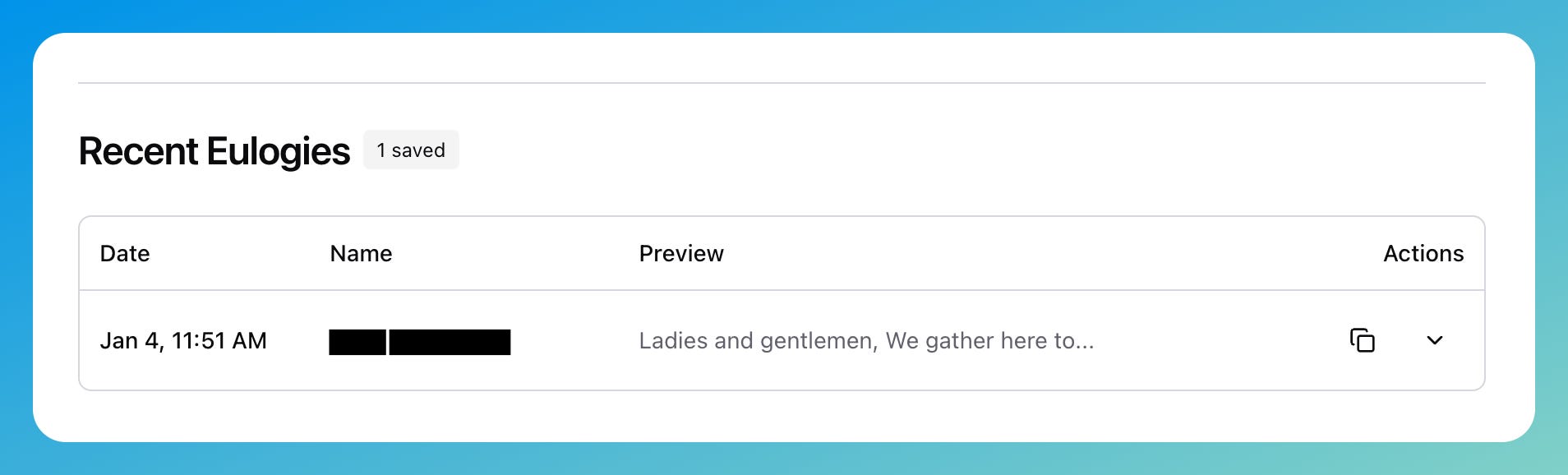
Eulogy History
You can now view your past eulogy generations! Every time you use our AI to help draft something, it’s saved — timestamped, organized, scrollable. This wasn’t a requested feature, exactly. It came from a conversation with a user who mentioned they’d generated something beautiful, closed the tab, and couldn’t remember exactly what they’d written.
That moment of loss stuck with me. Now it won’t happen again. And for those who need more generation (without limits) you can now upgrade to create as many as you may need. These are important moments so you want to get it right.
Documentation Consolidation
This one’s embarrassing to admit: we had too much documentation. Over 14,000 lines of it. Spread across files that duplicated each other, referenced things that no longer existed, and generally made finding anything a chore.
I cut it down by 84%.
Not by removing useful information — by recognizing that good code documents itself, and that a solo developer doesn’t need enterprise-grade specification documents (for everything). I need what I need and nothing more, especially now that it’s been working for a while and folks are happy!
Testing Overhaul
We went from 116 tests to 27. Before you panic: We didn’t just delete tests. We removed the redundant ones. Tests that tested tests. Tests for features that no longer exist (for whatever reason).
What’s left is a tight suite of essential E2E tests running against real infrastructure with real credentials. No mocks. If it passes, it works. If it doesn’t, something’s actually broken.
User Experience Improvements
A lot here so we’ll be quick:
Responsive Everything: The editor toolbar now adapts to smaller screens. The Save button shortens its text. The verify/pause buttons stack on mobile. Footer links hide on tablets. None of this is revolutionary—it’s just the kind of polish that means the difference between “this feels professional” and “this feels like it was built by someone who only owns a 27-inch monitor.”
Dark Mode Contrast: We bumped up the contrast on destructive and success colors in dark mode. WCAG AA compliance. Your eyes will thank us, even if you don’t notice the change.
Print Preview Simplification: We had a custom print preview modal. It was beautiful. It was also completely unnecessary when browsers have had a perfectly good print preview for decades. So we deleted it and now you just get native browser print. Less code, same functionality, fewer things to break.
Icon Centering: Icons are now properly centered on mobile. This is the kind of bug that would have taken me three months to even notice if someone hadn’t pointed it out. Now they float exactly where they should.
Removed Shinigami Theme System: This was the saddest removal but an important one for just “growing up” as maturing as a professional business. Sure, I love Misa, Ryuk, Light, and all the anime references but the reality is that most of our customers have no idea what that is.
Removing it was a good idea. My partner suggested in months ago and I dragged my feet on this for longer than I should have. Thanks BB!
Looking Ahead
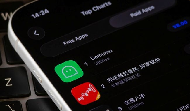
I’ve been watching a viral Chinese app called Demumu (formerly “Are You Dead Yet”) blow up. Their value proposition is remarkably simple: Check in daily, and if you miss two days, your emergency contact gets notified.
It’s positioned around loneliness and “being noticed” rather than death — a softer, more approachable framing that resonates with the 125 million single-person households in urban China.
Here’s the thing: We already have 100% of the infrastructure for this. Our proof-of-life system does exactly this, just with longer intervals and more features. So we’re exploring a new tier called Pulse — a stripped-down, affordable entry point for people who want daily check-ins without the full death-planning experience.
I’m still in the research phase so if you have thoughts about this I’d love to hear them! I’m still very much figuring out the right pricing and positioning. But the competitive analysis has been fascinating, and I’ll share more when there’s something to show.
By the Numbers
Since the last update:
84% documentation reduction
76% test suite consolidation (116 → 27)
13,300 SEO redirect issues fixed
16 email templates (unchanged, but verified)
25 API endpoints (unchanged, but all documented)
0 customer support tickets requiring intervention
That last one is still my favorite metric. I hope it doesn’t get larger than zero! The work never stops, but the good news is: The foundation is solid. Most of what we’re doing now is refinement. Polishing edges. Tightening screws. Making something that works into something that works well.
The best improvements are the ones you don’t notice because everything just… kind of… works. Imagine that.
Talk soon,
— Eight